This is a video of the lyrics to Elton John’s song named Daniel. This song was written by Elton John’s writing partner and edited by Elton John: it was released in “Don’t Shoot Me, I am only a Piano Player” album in 1973. The reason behind this song is that the writer had been seeing articles about what happens to veterans when they return, and he felt for them. This song is about a brother of a Vietnam veteran. The war had been going on for decades and ended a mere two years after this song was released. This song discussed a man missing his older brother who keeps going to Spain because he cannot face the hard reality of his past, so he escapes to Spain. The narrator explains his brother jetting off to Spain yet again and that he has scars and dead eyes from what he had seen in the past.
The purpose of this song is to enlighten the public on the harsh reality of war and how it affects people greatly (even after they return). The intended audience is Elton John’s fans, veterans, and families. The veterans and families can sympathies for this character in the song and feel connected to the song because they are going through the same. The actual audience is a much greater group than Elton John’s fans and those with a connection to war veterans. In reality this song was a huge hit and reached number 1 on the adult’s contemporary charters for a few weeks during the month of its release.
This song was a great way to connect Elton John and his music to the people. When viewers listened to the song they have an emotional appeal because of the slow tune and graphic and sad lyrics. Examples of these are when he describes the scars or describes the “clouds in my eyes” (from the ‘brothers’ perspective). This song also shows the heroism of veterans by adding in “you are a star in the face of the sky,” when discussing the veteran. All of this is utilizing pathos and he did this through singing a story, which makes logical sense. This song stuck with the people since it was a description of the countries current mood and struggles, and sympathized with and explained the bravery of the veterans and their families.
It's On Us: Sexual Assault PSA
This video appeared on the “It’s on Us” website and YouTube on September 18, 2014. The video is raising awareness of sexual assault and the website is a place where you can publicly (via social media) pledge that you will recognize, identify, and intervene on sexual assault. The video begins with faces with a white backdrop. Half the screen would be them speaking, about it being on us, and the other half would be them wearing “It’s on Us” apparel. The people in this video were not just your average citizens, but they were celebrities and politicians. We begin with the famous John Hamm with a solemn yet determined look saying “It is on us to stop sexual assault.” Within the first three seconds of the video they explicitly say their general purpose. More specifically, the purpose is to get people to pledge and be aware of the severe sexual assault problem and help the cause.
As the video progresses we see more actors including Kerry Washington, Joel McHale, and Rose Byrne. They selected a very diverse set of individuals to appeal to a wider variety of people. They each say how it is on us to stop sexual harassment. The repetition is a key rhetorical device to get the saying and idea ingrained in the audiences head. Then in the last 10 seconds the people speaking makes a change. Vice President, Joe Biden, appears on the screen and says the same thing as the celebrities. Finally, President Barack Obama ends the video with “Learn how and take the pledge on itsonus.org.” This video went from serving an audience that respects celebrities to an audience who respects the president. The video is going to appeal to a larger group of people because the fans of each celebrity with see this as well as the general American citizens because the White House made their statements as well. The diversity of people show how important this cause is, and the fact that even the President is involved implies it is a big problem.
This video appeals to pathos because of the slow music and serious and sincere faces. Most individuals will have a emotional connections to one or more of the individuals on the video as well. There is not one smile in this video. It also appeals to logos because it gives examples of how to help and it logically makes sense. Finally, it appeals to ethos because the President of the United States of America took a stand, as did the rest of the celebrities.
Zia
The shape above is the Zia symbol. This symbol is on the New Mexico flag. The reason that this sign stands out to me is because I lived in Santa Fe, New Mexico for 7 years. When I entered the culture I did not understand individuals obsession with the symbol, but over the years I have come to some conclusions about it. First off, this sign got to be on the state flag because it is deeply rooted to a New Mexico pueblo community. This is not the association for the people outside of the pueblo community though. This sign has a huge emotional appeal because they think it is New Mexico. Now what does “it is New Mexico” mean?
There are some unique qualities about this state. Some of the qualities are the obsession with local and extremely spicy peppers, Mexican food, Zozobra (burning of a paper mache man), Aspen trees, and so much more. They use this symbol as a sign of the culture and traditions of this distinctive place. This symbol also appeals to credibility (ethos) because it is on the flag and is a long-standing idea rooted form the original native culture. The ideas behind the Zia do change from person to person in New Mexico but the general idea of it having to do with New Mexico’s culture stays constant.
The Zia sign has a group that has learned to accept and embrace the symbol, and this is their audience. The audience is the people who understand this symbol and it is strictly New Mexico residence, and I have noticed people, outside the state, are baffled at how a symbol means so much. Nobody will understand more about the culture by looking at the symbol, but when someone who lived or lives there looks at it they have this overriding connection and understanding. The purpose of this symbol is the creation of a man made set of lines that connect and unite a place.
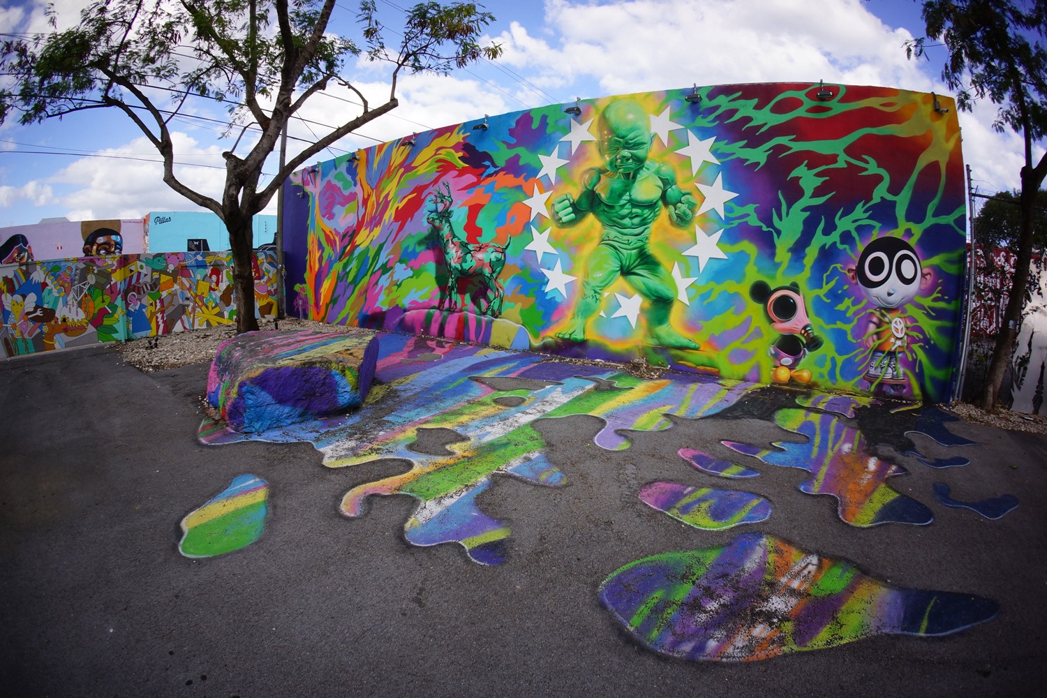
Wynwood Walls
The image above is from what use to be a warehouse district in Miami, specifically this segment of buildings with graffiti art on it is called Wynwood Walls. This type of art grew in this district and now the entire area is covered with graffiti from renown artists. Dozens of contemporary and cutting edge galleries moved into the area, and transformed this location from a warehouse district to a post-modern art sector.
The art in this district appeals to an audience who isn’t afraid to move past the traditional art borders. Graffiti has always had negative connotations of illegal activity for gangs and groups, but this type of graffiti takes a true artist to create. Bringing color to what use to be a warehouse area brings a whole new light to the area, and this appeals to pathos. This graffiti rejuvenated an area and created a whole new market for a sprouting type of art. If you ever happen to drive through this district your eyes will be memorized, each side road and the next road back is covered with complex graffiti art. All of the art has meaning and some suggest struggles. The meaning of these walls were created by the various artists who decided to transform an area. When I have visited this district in the past I have noticed an extremely vast audience attends. There are tourists, locals, and artists milling around and analyzing any wall they see. Also, putting all of this art in one area gives any artist the chance to put their work near renowned artists, and they all have the hope to revive and create an active artistic culture in this area.
Snapchat: Geofilters
This video is promoting people to use a new aspect to Snapchat called: Geofilters. What it does is adds another layer that indicated where you are to a image. What intrigued me most about this video is that they were clearly speaking to people who already know what Snapchat is and how it works. First they show someone taking a “selfie” at a unique coffee spot, and sharing her location with her friends. From looking at the screen of the phone Snapchat users will recognize this is a video for some aspect of Snapchat.
Following the interesting coffee location she goes to a somewhat local and fun exercise place, next to Venice and then Disney. Next there is a complete change in the screen and the background is white and all it says in black text is “Introducing Geofilters.” This dramatic change in image emphasizes these mere two words, and creates curiosity to the user on what Geofilters is. There is a slideshow of unique images that she has taken. The photos choose are associated with laughter and relationships, and this promotes pathos. There is also some ethos because the locations are generally pretty local looking, except for Disneyworld, and this will promote local businesses. Finally it promotes logos because everyone looks to be having so much fun and laughing, and don’t we all want to have fun. Snapchat creates a connection between laughter, unique experiences, and fun with their product.
Finally, snapchat ends with a yellow screen and their ghost logo. There are no words at all, so the audience must already know their logo to understand what this video is for. This is also a new feature so it is going to have a different audience than if they were trying to get the word of the entire Snapchat application out to the world.
Nike: Togetherness
This piece of rhetoric is comparable to the Snapchat video in the sense that the audience are individuals that already recognize the symbol, in this case Nike. The video itself it extremely interesting because it is shot in black in white. This black and white effect adds a new dimension and symbolizes tradition and history. I believe this is because they are talking about togetherness and it shows a city, but makes it seem like a community (which is a traditional concept). Black and white is associated with the past and this is a very bare bones sort of video in the sense that it is raw emotions and people.
A very iconic figure was also used, and it is interesting that LeBron was speaking of togetherness when he returns to his original team. People who understand basketball and sports, those would be the individuals who buy these shoes, will understand this connection. LeBron’s voice is also very powerful and this is associated with the intensity of the game and back to the raw emotions and the pathos of the video. This video is also inspiring in the sense that is people coming together to reach a goal, and working together to get there. This video contains an ethical appeal because of the amount of people and the famous LeBron James. Overall, the components of this video connect to the modern world (with the video of LeBron returning) and the philosophies of Nike, strength and tradition.
Law and Order, Special Victims Unit
The intro above is to the extremely well know show Law and Order Special Victims Unit. I have watched this intro hundreds of times, but have never stepped back and tried to analyze it, and it came off completely different when I did. First I noticed how all of the actors have a gold glow to their images, but the other images are in black and white. This is insinuating that the real world is very dark and the detectives bring color and a brighter light to New York City. They also broadcast the city a couple of times, revealing where they are through picturesque images. What was extremely interesting to me what the way they tried to use pathos. They have images of children, police cars, jail, a doll, a swing, and more. These items alone, specifically the doll, swing, and image of a child, mean nothing. They are day to day things, and do not connect with harm, but the way they have the black and white effect the images it makes it look creepy. With the swing the intro shows a long chain, that you may expect to be attached to something more gruesome, but it is merely a swing.
If you have watched the show you know that a lot of their cases are about children, and this is why they show these items in their intro. This intro is definitely set out to appeal to those who watch the show, otherwise it would seem rather normal to see a doll or swing, but to the avid viewer it seems extremely creepy. Then there is the music in the background; the harsh beats connect back with the black and white effect of the image, intense, dark, and not “good.” There is an American flag blowing in the wind, which connects this show to being a proud supporter of America and its people. This idea will appeal to individuals that feel a connection with the flag and our country. The text at the end of the intro states the title is big and strong on a dark background. Again we see the gold, and the red and blue (connecting it to America again). Overall, I see a lot of appeals and techniques used in this into that I had never noticed before.
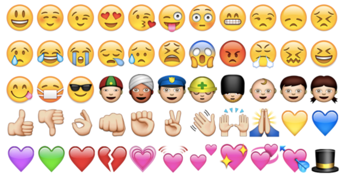
Emoji
The image above displays some of the emojis that you can find integrated onto any Japanese device. Emoji’s have become so popular that they are extremely common in America as well, and they have been coding phones so they understand emoji’s even if they come from a different device. Emoji’s are a way of expressing emotions and putting a pathetic appeal into a text. Each emoji has a distinct meaning, and we (as a culture) have put our own meanings into these rather abstract images. What amazes me is how widely understood and known they are. This is a clear piece of visual rhetoric because it is describing through emotions by utilizing a visual. I will describe the rhetoric of an emoji in particular, as an example of their singular meaning. The first emoji listed is a smiley face, and this is different from the second blushing face, and this emoji would be used when someone is excited. Now, if they used the blushing face it could be interpreted as flirting or embarrassment. This is how much cultural context there is surrounding these icons. As a whole, emoji’s symbolize a way of communicating that is expressive and fun. It adds a new dimension to writing that can add a new appeal that wasn’t directly seen before.
The audience that understands emoji’s and their meaning singularly and as a unit generally leans to the younger people. Millenniums are the highest user of emoji’s, but older generations are quickly catching on. The reason these icons appeal to this audience and there is more meaning to this audience than others is because Millenniums were raised in a time where there was less true contact and connection since communications were often digitally. This is a way to bring true humanly interactions back through images of feelings, but still utilize technology to communicate.
Chevy Commercial
From first glance, you wouldn’t immediately think this is a Chevy commercial. We have the solemn background music and a woman showing affection for her dog. The first scene looks like the vets office,, and then we see these flashbacks. It is interesting to me that the video producers decided to go backwards instead of forwards, but the gist of this is that you can see the see so many memories through a connection with a dog. As they progress backwards you see this woman get younger and move into a new apartment, get a house, break up with a boyfriend, and learn to drive. A viewer may begin to feel a connection to this woman and have a emotional appeal to the video. It also appeals to ethos because you can see the ages and the same (or what looks like the same) individual from young to old. This also appeals to logos because it is a logical time sequence, even though it is backwards. We can understand and relate in a logical and emotional way to the triumphs of moving into a new apartment, graduating, or breaking up with someone. The one thing that is focused on is how the dog was there through thick and thin. Some may even relate to an animal being there for us in this way, even more specifically a dog.
After 46 seconds we see her learning to drive a Chevy, and this is truly what the commercial is for. Finally, we see her picking out the puppy and naming it which it utterly adorable and may appeal to many for that reason alone. Next the advertisement flashes forward again to the older woman and dog, and she kisses it. Then again a flashback to her grabbing the dog and it states “a best friend for life’s journey.” What a simple yet comprehensive statement. The only difference is this text is on top of the Chevy, not the dog. Here is where they are putting the connection of a dog being that long standing friend with the car. The end of the advertisement is a black background and a Chevy sign, this videos audience is for individuals who already know of Chevy (since most of America does), and doesn’t want to call attention to their product, but the emotional bond the product has and how it can handle thick and this. This commercial shows the longevity of the car and how it is fit for all occasions.